Reports
What each number means, and how it was worked out. Core is one screen; Full is the same page with everything on it.
Core and Full
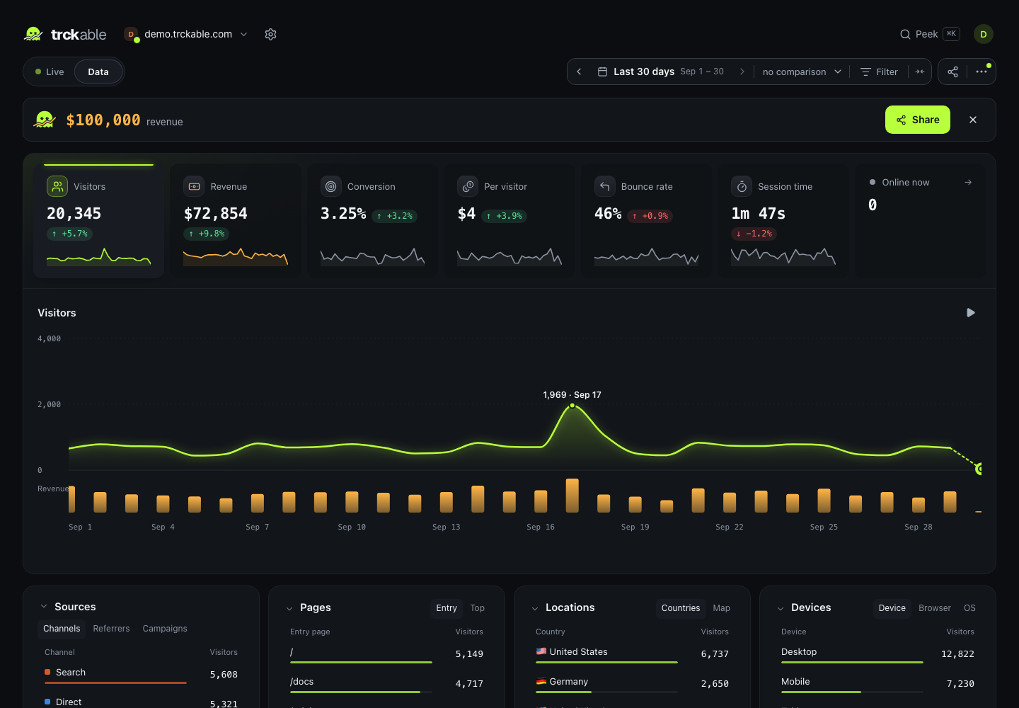
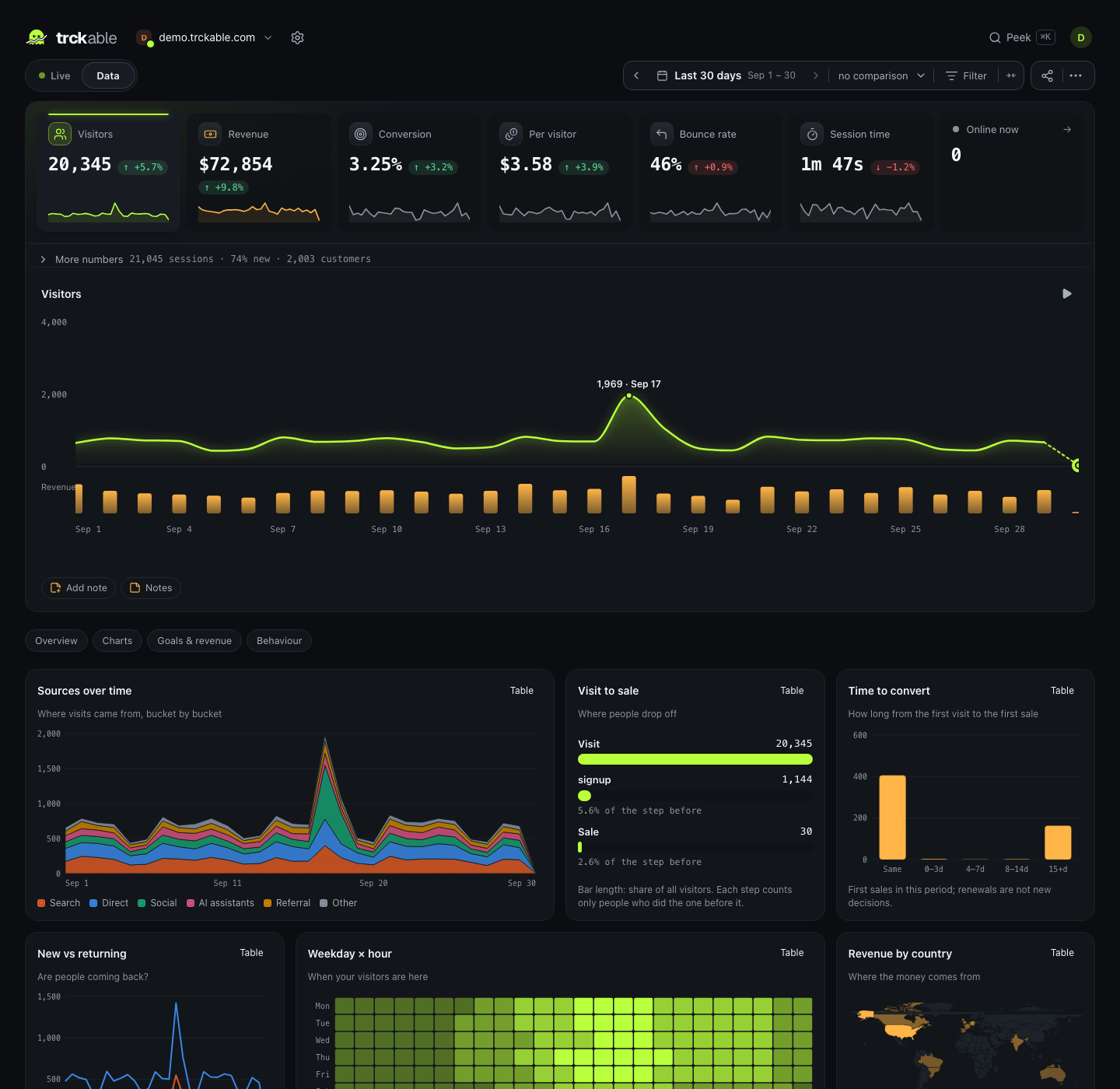
The dashboard has one page and two densities. Core is the numbers, the chart
and four cards — one screen, nothing to scroll past. Full, on F, opens
every card into a longer table with bounce, conversion and revenue on each row,
and adds goals, campaigns, journeys, cohorts, the map and the live feed.
Switching does not reload anything. Full's extra views are a separate chunk, so Core never downloads them.
Periods and comparing
The date picker offers its periods in three groups:
| Group | Periods |
|---|---|
| Live | Now, Today, Yesterday. Now is today by the hour, and refreshes itself |
| Rolling | Last 7 days, Last 30 days, Last 90 days, Last 12 months |
| Calendar | This week, This month, Last month, This year |
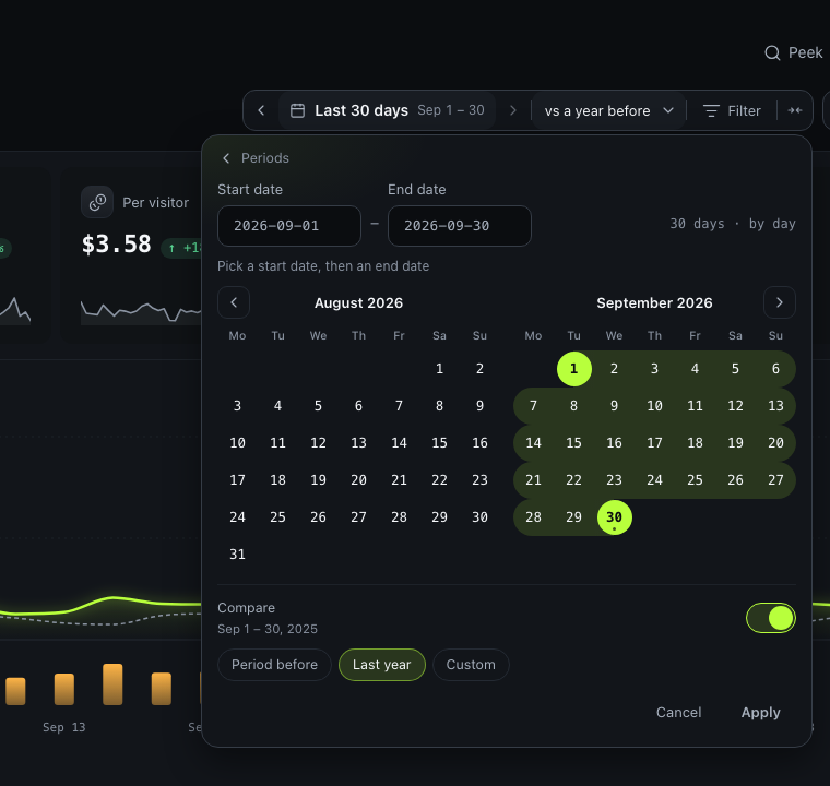
The week starts on the day set in Settings → General → Reports. Custom dates opens a two-month calendar, and the start and end can be typed. The day, the time and the timezone at the top are the site's own.
Compare with the period before adds a second line for the same stretch before. For a calendar period that is the same part of the one before: This week so far against the same days last week, this month so far against the same days last month. In the calendar view, the comparison can instead be Last year (the same dates a year before) or Custom, dates you pick.
The numbers at the top
| Number | What it means |
|---|---|
| Visitors | Distinct people in the period, always exact in the headline number; above 250,000 sessions the chart and the breakdowns estimate, and the dashboard says when |
| Pageviews | Every page shown, including route changes in a single-page app |
| Bounce rate | Sessions with one pageview and no interaction |
| Session time | Average time from a session's first event to its last |
| Online now | Visitors in the last five minutes |
With the revenue module on, three more appear by themselves: Revenue, Conversion and Revenue per visitor.

Sessions
A session is server-side and ends after 30 minutes of inactivity. It is not a cookie or a timer in the browser, so closing a tab and coming back two minutes later is one session, and leaving a tab open overnight is not a six-hour visit.
Engagement time counts only the seconds the page was actually visible. A tab left open behind another window earns nothing.
Sessions are rolled up once, in the same database transaction as the events they are made of, which is why a crash cannot produce a half-counted day.
Bounces
A bounce is a session with one pageview and no interaction — no goal, no outbound click, no second page. Time on page does not enter into it, because a page nobody interacted with has no reliable duration.
The chart
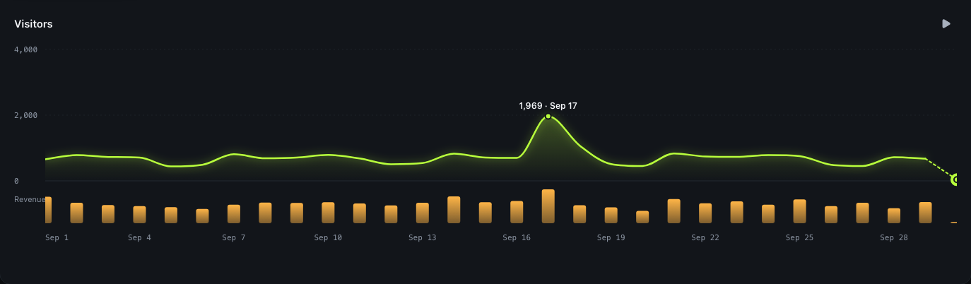
Bars or an area, per hour, day, week or month; trckable picks a sensible
interval and the ⋯ menu overrides it. A compare period draws as a ghost line.
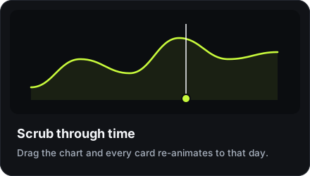
Click any day, or drag the scrubber in Full, and every card on the page
re-animates to that day.
Notes mark what happened: a launch, a post, an outage. A note belongs to the day it happened, which you choose — not necessarily the day you are looking at.
Filters and saved views
Click any row to filter by it. Filters stack, they appear as chips under the date picker, and they are in the URL — so a filtered view can be pasted into a message and opened by someone else.
A set of filters you use often can be saved as a view, with the period it was saved with: the Views button beside the filters lists them, with a search, and opens, renames or deletes one. A site can keep thirty.
The Filter button beside the date picker is the other way in, for when the row you want is the four hundredth, or is not on this screen at all. It lists every dimension grouped — acquisition, content, location, device, behaviour — with how many values each one has, then lets you search inside it. The values come from the report already on the page, so opening it asks the server nothing.
Taking it with you
⋯ → Export as CSV writes the view you are looking at to a file: the same
range, the same filters, the same attribution model. One long table —
dimension, value, visitors, sessions, pageviews, bounce_rate and, once
payments are connected, revenue, currency, customers — which is the shape a
spreadsheet pivots without being rearranged first. It holds totals, not single
visits: there is no export of raw events yet.
It carries more than the screen does: up to a thousand rows of every
breakdown, every bucket of the chart, every goal, and the total as its first
row. With a comparison on, a compared total row follows it, for the other
period. The same file is at /api/v1/sites/{site}/export.csv with the same
parameters as the report.
Share as a picture or a GIF
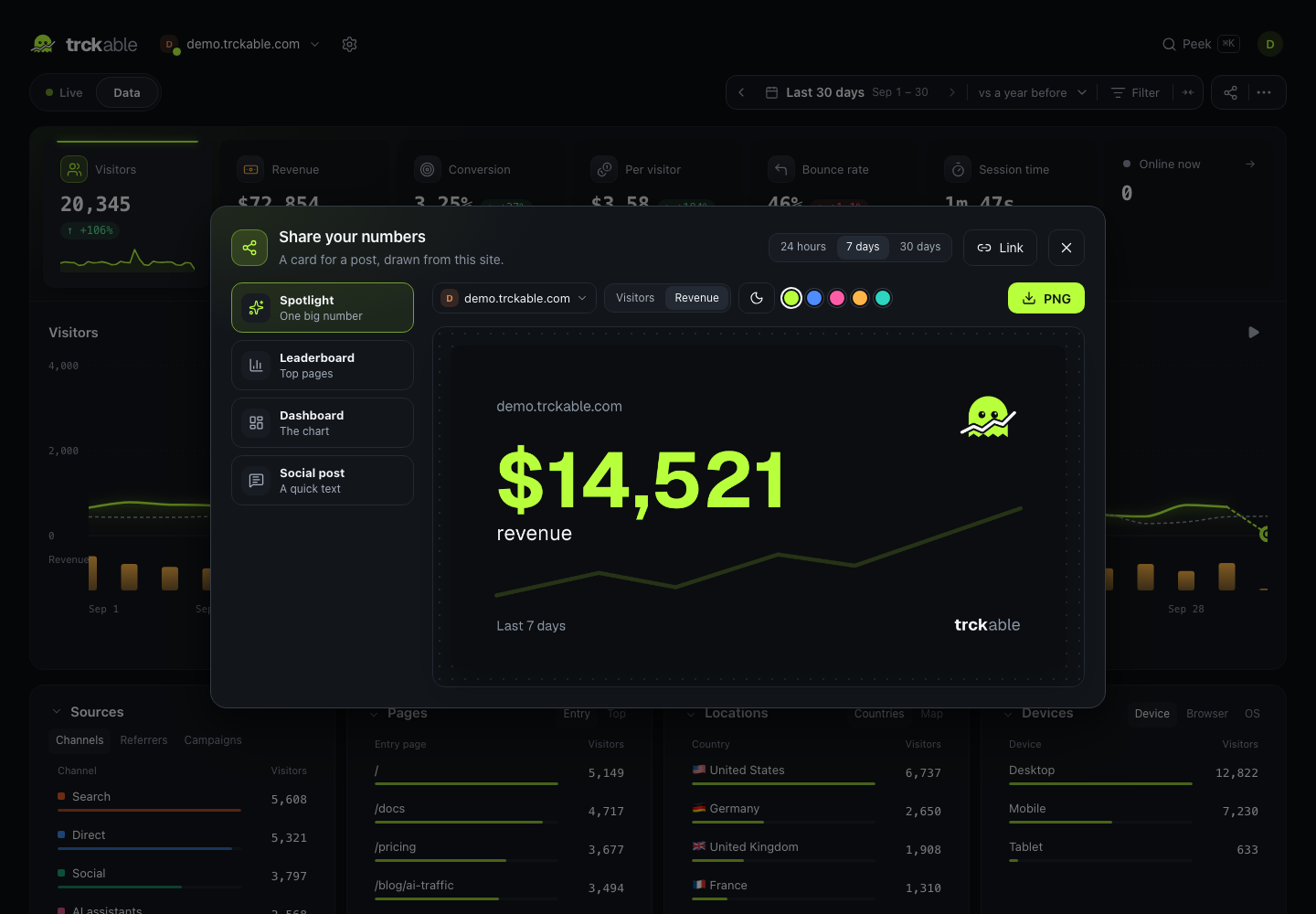
Share, next to the period, turns what you are looking at into a card for a post: the same period and the same comparison, in the same words as the date picker. Pick the big number (visitors, pageviews or revenue), up to three more (bounce rate, visit time, top source, top country…), a look and a size: a post (1200 × 630), a square (1080 × 1080) or a story (1080 × 1920). Switch the preview to GIF and it plays the file you will get: the number counts up and the line draws itself, then it loops.
The card is drawn in your browser. Nothing is uploaded: you download it, copy it or hand it to your phone's share sheet. Revenue is only in it if you add it, and every card says "Counted by trckable". A milestone (your 10,000th visitor, a best day, a first sale) offers the same card when it happens.
The cards
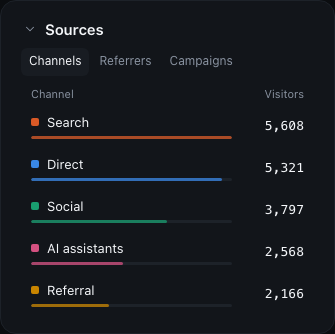
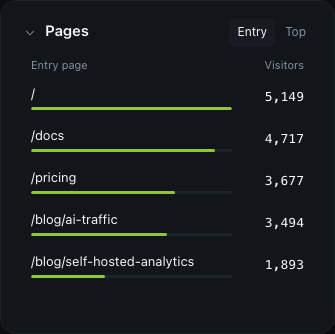
| Card | Tabs |
|---|---|
| Sources | Channels, Referrers, Campaigns, Search (with Search Console) |
| Pages | Entry, Top, Exit (Full), Scroll (Full), Sections if you defined any |
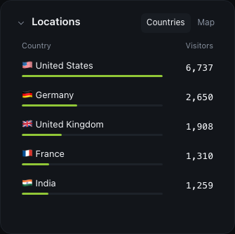
| Locations | Countries, Regions (Full), Cities (Full), Map |
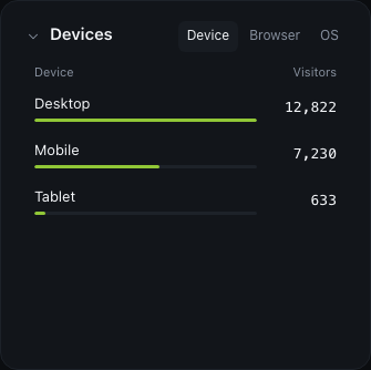
| Devices | Device, Browser, OS |
Regions and cities only appear when the site records a city — see Privacy.
Scroll is how far down each page people read: the average depth, and how many views got at least three quarters of the way. Every engagement ping already carries it, so there is nothing to turn on. A view that sent no ping (closed within a moment) has no depth and is left out rather than counted as zero.
Sections are content groups: patterns like Blog = /blog/* that let you
read a site by area instead of by four hundred URLs. Settings → General →
Reports → Sections.
Every site at once
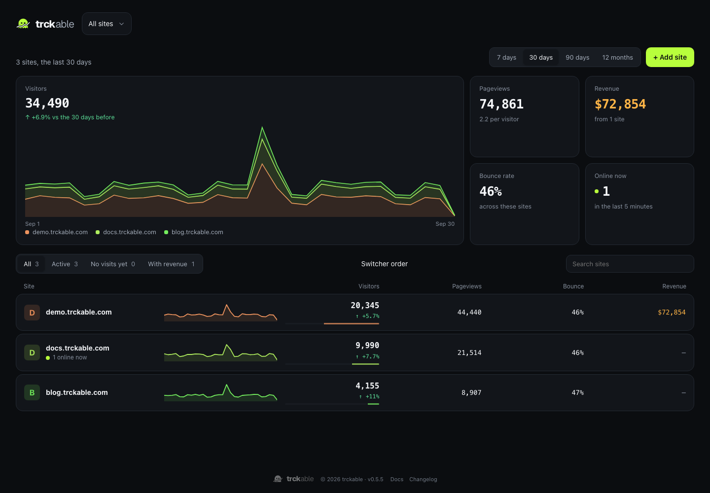
With more than one site, the site picker starts with All sites: one row per site with its visitors (and the change against the period before), pageviews, bounce rate and revenue, a small line of the period, and who is online now. Each site is read in its own timezone and currency. Click a row to open that site. The period is 7 days, 30 days, 90 days or 12 months.
Accuracy, honestly
- Visitor counts are exact until a period contains more than 250,000 sessions. Past that they are estimated with HyperLogLog, and the dashboard marks them. The KPIs are always exact.
- Cookieless mode rotates the visitor id daily, so new-versus-returning is only right within a day. The dashboard says so where the number is.
- Ad blockers stop some visits from being recorded at all. No analytics tool is immune; the proxy install is the honest mitigation.
- Bots are filtered by user agent, by
navigator.webdriverand by rate limits. Robots that announce themselves are counted separately, in the AI crawlers module. Stricter bot filtering (Settings → Data & privacy) also drops visits from data-centre networks. - Referrer spam, sites that fake visits so their name shows up among your referrers, is dropped for every site, using Matomo's public list of known spammers, which ships inside trckable.